
HELLO, I'M
Slone Early
Geographic Information Sciences and Technology
Major + Computer Science Minor

Slone Early
Pursuing a Bachelor's in Geographic Information Science and Technology and minor in Computer Science. Tennis tournament business owner. Freelance tennis coach. Member of Texas Aggie Game Developer's Club and Texas A&M Club Tennis.
I do a lot of things...
254-223-1228


Projects
Top 100 Tennis Players and Their Home Country

For my final project in Cartography and Visualization (GEOG 232), I created an interactive ArcGIS StoryMap exploring the relationship between median household income and sleep deprivation across U.S. counties. Using bivariate choropleth mapping, I combined socioeconomic and public health data from the 2022 County Health Rankings to investigate whether financial stress and sleep habits overlap geographically.
The project began with extensive data acquisition and preparation, including cleaning tabular datasets, joining them to county boundaries, and formatting them for visualization. From there, I designed a bivariate color scheme optimized for accessibility, enabling users to quickly identify counties with “double highs” (high income and high sleep deprivation), “double lows,” and everything in between.
The StoryMap integrates interactive mapping, statistical context, and visual storytelling to make complex spatial patterns accessible to a broad audience. It highlights key findings, such as:
-
Counties with the lowest household incomes had on average 42.7% of adults reporting fewer than seven hours of sleep per night, compared to 32.3% in the highest income counties.
-
McCreary County, KY, had both one of the nation’s lowest household incomes and the highest sleep deprivation rate at nearly 50%.
-
Summit County, UT, showed the opposite trend, combining one of the highest incomes ($115,756) with the lowest deprivation rate (25.6%).
-
In addition to the analysis, I incorporated reviewer feedback to strengthen the project’s clarity and narrative, refining the conclusion to acknowledge the complexity of causation while emphasizing the significance of observed correlations.
This project demonstrates my ability to:
-
Transform large, multivariable datasets into meaningful geospatial visualizations.
-
Apply cartographic principles and thoughtful design choices to improve interpretability and accessibility.
-
Communicate data insights through compelling storytelling and interactive mapping tools.
-
The result is both a research-driven visualization and a public-facing communication tool that bridges the gap between academic analysis and everyday understanding of public health and economics.
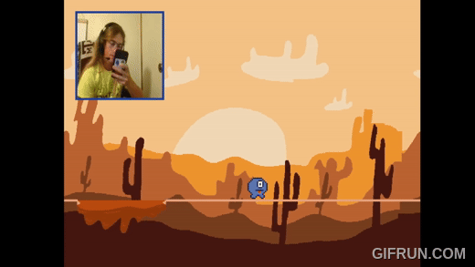
The Waiting Game
Throughout my educational career, I have struggled to maintain focus in class and on my schoolwork. My mind always drifts or becomes easily distracted. Over the summer of 2024, when I took the online class CSCE 221, or Data Structures and Algorithms, I struggled with concentrating even more than usual. For better or worse, this sparked an idea for a new project: a video game about paying attention!
The Waiting Game uses PyGame (Python) and OpenCV to take in facial recognition data to control your character on screen. The main character, Zimblort, is trying to walk across a tightrope, and if the player looks away from the screen, gets on their phone, dozes off, etc., then Zimblort will lose balance and fall off.
This project was particularly tough to manage with my intensive online class, but I learned so much about Python and facial recognition technology. I also learned about packaging and distributing Python code files into a playable .exe file.
The game can be viewed and downloaded at slahn.itch.io/the-waiting-game. The code for the game can be viewed at github.com/slahns/Waiting-Game.

Spur Tennis Club

